
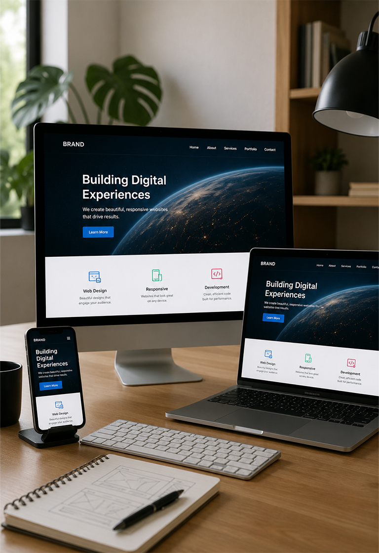

Creating Responsive Web Designs: Best Practices and Tips
9 min read
20 July 2026
By Aijaz Mughal
The first impression of your website is very important. Visitors make quick judgments. The device they use changes this feeling a lot. A mobile phone offers a different experience from a desktop computer. It doesn’t matter that they are visiting your site from a smartphone, tablet, laptop, or even desktop. They expect the same smooth browsing experience without delays plus layout issues.
According to the Pew Research Center, 15% of American adults are accessing the internet completely from their smartphones and these users do not have standard home broadband services.
Users are changing their internet browsing habits consistently. This shift makes responsive web design a major requirement for modern companies. Partnering with a skilled web design company in the US guarantees your site looks perfect on all devices. Such a smooth visual experience naturally boosts user interaction alongside actual purchases.
The Layout Gap: Desktop-Centric vs. Mobile-First Web Design
Before writing a single line of interface styling code, design teams must look past basic aesthetic layers to review how structural layouts impact user behaviors. Many online merchants assume that international buyers are willing to manually pinch, zoom, and scroll around desktop layouts on small viewports. However, multi-device interaction analysis shows that forcing users to perform physical screen corrections introduces immediate cognitive friction right at the point of choice.
Operating a digital storefront without a modern responsive foundation leads to a severe loss of customer acquisition capital. To illustrate this performance gap clearly, look at how professional responsive web design alters essential brand engagement metrics across standard domestic business operating cycles:
Multi-Device Digital Inbound Metrics
|
Interface Performance Metric |
Legacy Desktop Layout |
Responsive Mobile Layout |
|
Mobile Bounce Rate Percentage |
Highly elevated and ranges from 68% to 75% on average. |
Exceptionally low. Stays tight between 22% and 28%. |
|
Cross-Device Cart Completion |
Minimal and broken checkout forms block transaction paths. |
Maximum, fluid form fields capture immediate sales volume. |
|
Search Engine Placement Rank |
Penalized; algorithmic systems downgrade static code. |
Dominant; prioritized indexation builds organic authority. |
|
Brand Trust and Loyalty Index |
Low, unoptimized layouts look unprofessional and outdated. |
High, crisp user journeys build long-term retention. |
(Source: Contentsquare Digital Experience Benchmark Report and Baymard UX Benchmark Database.)
Relying on a rigid desktop framework leaves your platform completely vulnerable to rising user acquisition costs. Building an authoritative responsive site requires a sophisticated structural foundation that only an elite Web Design Company in the US can deploy cleanly.
What is a Responsive Web Layout?
A responsive web layout is an advanced front-end engineering framework that enables a website to automatically reshape its complete visual hierarchy based on the physical screen dimensions of the target device. Instead of serving different code packages to mobile and desktop devices, a unified source file uses flexible media parameters to adjust typography, imagery, and alignment grids dynamically. The layout adjusts every piece automatically to keep your main text blocks perfectly balanced. It functions accurately. Independent of whether the visitor accesses it using a PC screen along with a mobile phone.
Why Build a Responsive Website for Your Business?
Creating a flexible layout is vital to stop visitor frustration. This smart approach keeps buyers engaged while boosting your search rankings. When target consumers can review services, scan product options, and complete complex checkouts effortlessly on their smartphones, it builds immediate transactional confidence. Spending resources on a solid plan to build a responsive website protects your marketing budget. This careful approach makes sure that excellent performance across all modern web browsers while turning random visitors into loyal customers over time.
5 Essential Best Practices for Responsive Web Design and Interfaces
A website that displays superbly on every single screen needs a solid coding plan. Developers must apply a smart front-end approach to handle various device sizes properly while keeping the layout stable. Our dedicated development team divides cross-device interface scaling into five different technical focus areas.
1. Implementing Mobile-First Web Design Methodologies
Legacy development workflows traditionally started by constructing expansive desktop designs, then attempts were made to strip away elements to fit smaller viewports. This backward methodology often resulted in bloated code files, messy layout overrides, and incredibly slow mobile load times.
Modern UI systems prioritize a strict mobile-first web design sequence. By designing for the most restricted viewport size first, our teams isolate your main features and value propositions. Once the mobile architecture functions flawlessly, we scale the code upward to fill larger screens, ensuring your platform operates at peak efficiency.
2. Prototyping Responsive Design Figma Frameworks
Building a faultless interface requires close collaboration between your creative visual artists along with your front-end development teams. Attempting to code complex multi-device structures without rich interactive blueprints always leads to broken page layouts and misaligned padding variables.
Our design groups resolve these visual friction gaps by building comprehensive responsive design Figma prototypes before launching local development servers. We map out exact layout behaviors across standard, tablet, and desktop viewports, using component variations to ensure your visual branding elements translate perfectly across every possible screen resolution.
3. Deploying Fluid CSS Grids and Flexible Typographic Scales
Hardcoding fixed pixel widths into your layout sheets causes severe text clipping and horizontal layout spillages when pages open on unusual device screen sizes. A modern responsive layout completely abandons rigid structural definitions in favor of relative sizing properties.
Our development groups build interface grids using percentage-based widths and flexible viewport units instead of traditional values. This allows text sizes, navigation menus, and information containers to expand or contract organically based on the specific viewport width of the browser window.
4. Setting Strategic Breakpoints and Viewport Meta Tags
Configuring an interface to look identical across every single phone or tablet model on the market is technically impossible due to constant hardware releases. Real dynamic layout is achieved by setting smart styling breakpoints that target specific device category widths rather than individual models.
We inject optimized viewport meta tags into the core header of your website files to instruct browser systems to match page sizes with the device screen dimensions. Our teams establish adaptive style switches at standard width thresholds, allowing your site navigation menus to transform into clean mobile drawers the moment a viewport shifts.
5. Optimizing Media Assets and Touch Target Accessibility
High-resolution photography assets that look stunning on desktop screens can destroy your mobile performance if they are served without proper compression. Large file arrays exhaust cellular data connections and cause massive server-side rendering delays on mobile devices.
To guarantee lightning-fast performance, our engineering groups implement adaptive image markup that serves smaller image resolutions to mobile viewports automatically. Also, we increase the size of interactive elements as well as the button targets to guarantee mobile users can navigate your platform comfortably without accidental mis-clicks.
Technical Challenges with Performance Optimization and Browser Interoperability
Navigating multi-device plugin setups involves managing complex technical variables behind the scenes.
“Making a website run perfectly on every single browser is a huge task for programmers. This problem goes way beyond a simple issue for the development team. The MDN Browser Compatibility Report shows that almost half of all web developers face issues with page layouts looking different across various platforms. Nearly twenty percent of these coders specifically mention trouble with visual animations coupled with cross-browser performance tools.”
When custom style sheets lack clean configuration rules, automated platforms struggle to render complex typography or handle interaction triggers across legacy mobile browsers.
According to the HTTP Archive Web Almanac, the average mobile webpage now exceeds 2.3 MB. Large JavaScript files with poorly compressed images frequently overwhelm mobile device processors.
To eliminate these technical bottlenecks, professional developers write highly refined CSS sheets that keep script execution paths clean and responsive. We confirm that your main layout components remain extremely fast and minimize browser rendering overhead and keep your code completely safe at the same time. It is also fully compliant with modern web accessibility guidelines.
Final Words on Responsive Web Design
Making sure about the compatibility across all devices is really a critical requirement for companies focusing to lead in current online market. While implementing advanced fluid grids requires careful cross-browser testing and systematic design prototyping, it provides an exceptional return by capturing higher user engagement and driving transactional conversion growth.
Ultimately, your choice of layout architecture impacts your complete bottom-line revenue. Whether you are using an automated responsive website maker for simple landing pages or engineering a complex custom platform from scratch, the end user experience must stay at the center of your plan. Building a fast, clean technical foundation keeps your business steps ahead of rival brands.
FAQs
Q1. How does responsive web design improve search engine rankings?
Search engines prefer and favor sites that function smoothly on mobile devices. A flexible site provides a superior user experience. This positive interaction naturally boosts your position in search results.
Q2. What separates responsive design from adaptive design?
Responsive design automatically adjusts to match any screen size using flexible grids, but this is not true for the adaptive design. Because it relies on fixed layouts made for specific device widths.
Q3. Can you convert my existing website into a responsive format?
Absolutely. A skilled development team can update your current design as well as the underlying code. This process ensures full compatibility across all modern devices.
Q4. Why is a mobile-first strategy superior for web design?
This method prioritizes essential content right from the start. Focusing on core features first results in a faster, highly intuitive website.
Q5. How do you guarantee a responsive site works everywhere?
Our team tests every project across various browsers, together with multiple screen dimensions. We also use actual physical devices to verify smooth performance for all visitors.
Author
A
Aijaz Mughal
Mr. Aijaz Mughal is a trusted advisor and thought leader in digital marketing and business growth with over 20 years of extensive experience. Throughout his illustrious career, he has had the privilege of working with top-tier brands such as Emaar, Masdar, Honda, Leejam, Unilever, The Dubai Mall, Emerson, Moorfields, and Yamaha, where he has made significant contributions to their digital marketing success.
Speak to an Expert